Blog
Signing has always been about function, it is what enables people to navigate their way through a system whether that be a building, transport hub or shopping centre, the end goal is the same - ‘what is here’ and ‘where you are’.
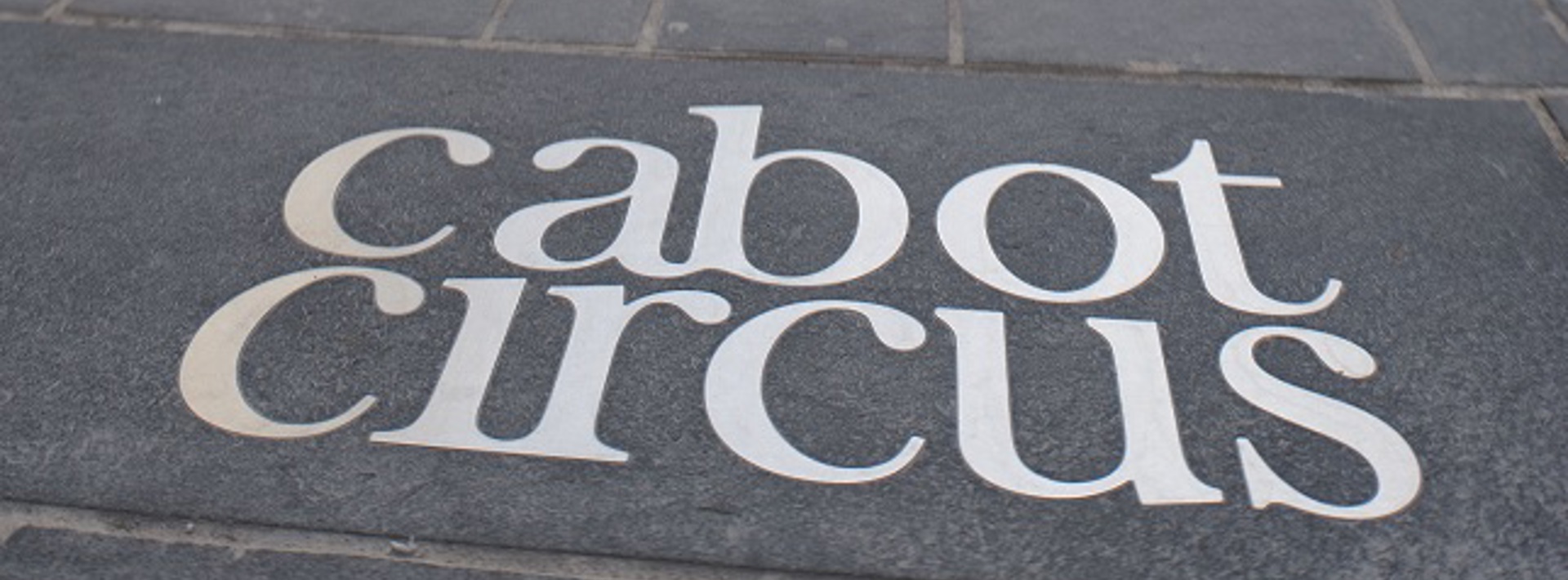
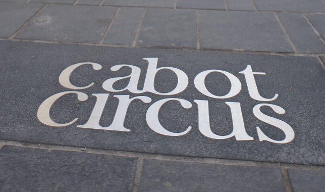
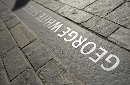
However, in recent years we’ve started to see a shift in the practice of wayfinding and signage, with architects and graphic designers teaming up to create new environments that utilise the common components of a building, using them to enhance the wayfinding system and unify designs. Gone are the days of working in isolation from one another.
To me this scenario makes perfect sense, as both a designer and fully paid up member of the public, a lot of the time I have to live with the results on a day-to-day basis of badly designed signage systems. Surely it is better that as a combined force we put our heads together, using our knowledge and expertise to create well thought out, beautifully executed signage systems.
Signage is no longer just a device to get us from A to B, it is now also seen as an expression of a built environment, lending itself to the architecture and in some cases becoming an art form in it’s own right. It’s less of an add on, more a crucial integrated component.
There are a few studios that are embracing this methodology such as the likes of Studio Myerscough, Pentagram and A Practice For Everyday Life.
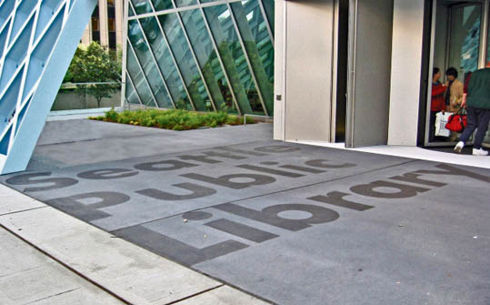
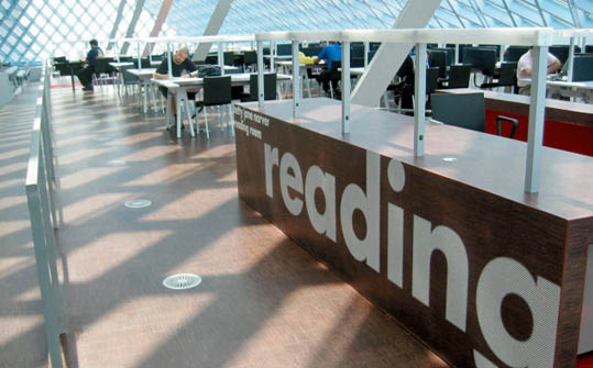
The work being produced by these studios is bold, expressive, experimental. There is also a healthy interest in manufacturing methods, materiality and form that allows signage to sympathetically blend with the built environment it sits in, yet stand up in it’s own right. One such example is of the Seattle Library developed by Bruce Mau Design.
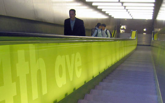
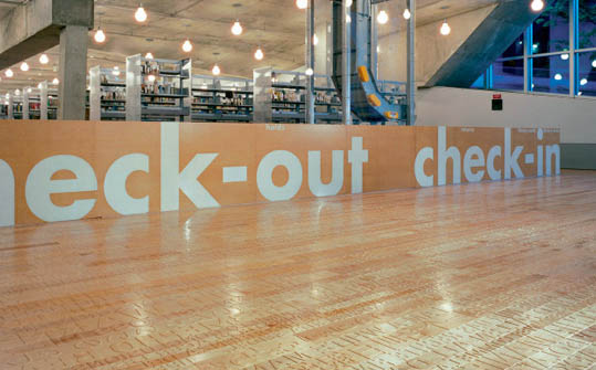
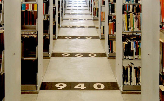
The signage was integrated seamlessly into the architecture of the building by using playful supergraphics, walls of colour, sandblasted "wordmarks" and an innovative use of materials. For the “Spiral” (the Collections Area) which was made up of garage-like ramps, they devised flexible “stack mats” made from die-cut rubber that could be picked up and moved to accommodate expanding collections.
Instead of increasing shelf space for reading, listening and viewing materials, they used digital storage technology to free up human space where visitors could interact with bothcultural knowledge and each other. Working with architect Rem Koolhaas and Seattle-based LMN Architects, Bruce Mau Design applied this experimental principle to every aspect of the creation of this new public space – including the actual design process. All major decisions were conducted with total transparency, with open meetings and televised presentations where input was sought from the public.
As a result their design scheme was unlike any sort of typical library signage seen before. It was more architectural with directional information integrated into the walls, floors and stairwells. Scale and the application of typography as a visual graphic was a key principle to convey the messaging. The system intertwines with the surrounding walls, embracing the modernity and clean lines of the architecture. For a library the very core purpose is about words and this signage scheme certainly makes the most of words.
Interestingly a statement from the studio resonates strongly with how a lot of libraries tired signage often ends up.
“It is not without heart-breaking irony that we acknowledge a near-total lack of legibility in our collective repository of typographic history – the typical library. In the beginning, there was one problem, books, and one solution, shelves. When you go into the library now, there are literally hundreds of signs and pieces of furniture provided to deal with each new format. Everything from magazines to DVDs has a cabinet, a users’ manual, an inventory, and an interface.
The result is a massive communication problem. While librarians themselves should be commended for their improvisational tactics, overall the patrons confront a constant meddle, with one organisational layer of information Scotch-taped over another. The time has come to imagine a new way.”
Words taken from Life Style by Bruce Mau
One thing for sure is that Seattle Library has set a precedent, where signage pushes boundaries, can be more expressive and not fall into the constraints of a photocopier and Scotch-taped scenario.
This is a very good example of how best to sign without the use of the ‘traditional’ styled signs that many of us are use to seeing and for that reason we think it’s great.
Senior Graphic Designer
Maynard Design Follow Maynard on Twitter
Further Reading & Links:
Society for Environmental Graphic Design - The global community of people working at the intersection of communication design and the built environment.


