It’s been a busy 12 months in the design world, with architects continuing to innovate and push boundaries in order to meet the demands of our ever-changing environment. But what defines the best building design in 2016? According to RIBA, the crème de la crème of architecture must have the ability to improve people’s lives, be sustainable, add value, make the most of its budget and stand the test of time.
With that in mind, and with the year drawing to a close, we take a look at some of 2016’s best architecture; the builds that have been earned plaudits for their design along with one that didn’t quite hit the mark.
Public spaces
Stihl Treetop Walkway
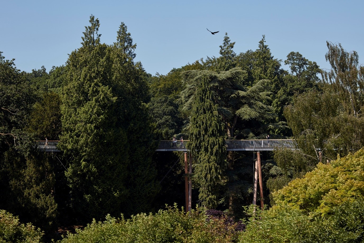
Glenn Howells Architects are behind an elevated new walkway 43 feet above the ground at The National Arboretum in Gloucestershire. Meandering for 1,000 feet throughout the Grade I-listed landscape, the new addition offers visitors a chance to get up close to some of the thousands of trees that litter the 240-hectare estate, as well as panoramic views of the surrounding environment. The walkway has been formed into an ‘S’ shape, snaking through the forest with crossing timber legs, steel balustrades and wooden handrails. There are also intermittent widenings throughout the structure, providing extra space for visitors to view specific attractions.
Elephant and Castle
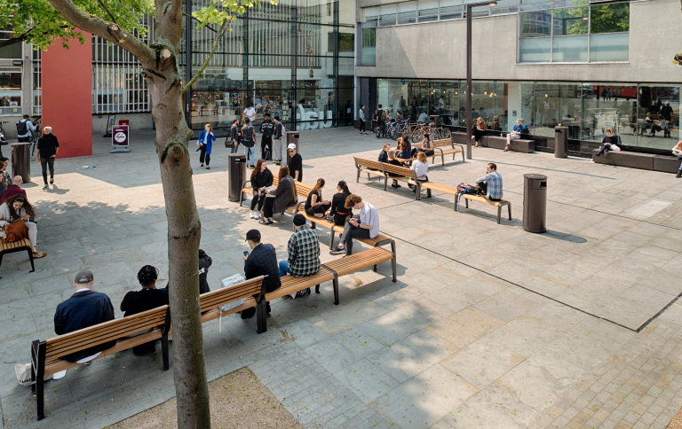
This pocket of South London is getting a £3bn makeover in a bid to regenerate the area into a thriving new public space. The masterplan, which includes new homes, a shopping centre and music venue, is set to be in place by 2021. But 2016 marked the year that its outdoor spaces were paid particular attention, with the creation of an attractive new physical environment boasting tree-lined streets, social seating and high-quality open spaces.
Victoria Gate Leeds
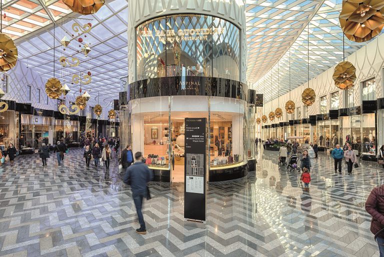
A new shopping centre has landed in the heart of Leeds, offering an exciting and expansive retail destination in the Yorkshire city. ACME has been at the helm of this £165million project, creating a statement building designed to reflect the Victorian architecture heritage of its location. Drawing inspiration from the city’s history, the exterior features a white latticed concrete façade which is said to mirror Leeds’s tradition of textile manufacturing, while the interior has been fashioned on previous historical arcades with herringbone flooring and curved glass store fronts.
Tate Modern Switch House
The summer of 2016 marked the opening of the Tate Modern extension that’s been overseen by Herzog & de Meuron. Featuring a 64.5 metre ‘pyramid’ tower, this new section of the famous gallery has created 60% more exhibition space, connecting to the Tate’s existing galleries with indoor bridges. Latticed brickwork and folded surfaces form the building’s exterior, matching the brickwork of Giles Gilbert Scott’s original power station that houses the Tate Modern; while a new roof terrace offers sweeping views of the city. Switch House has received rave reviews from critics and is being touted as ‘the UK's most important new cultural building since the British Library’.
Private spaces
Maggie’s Manchester
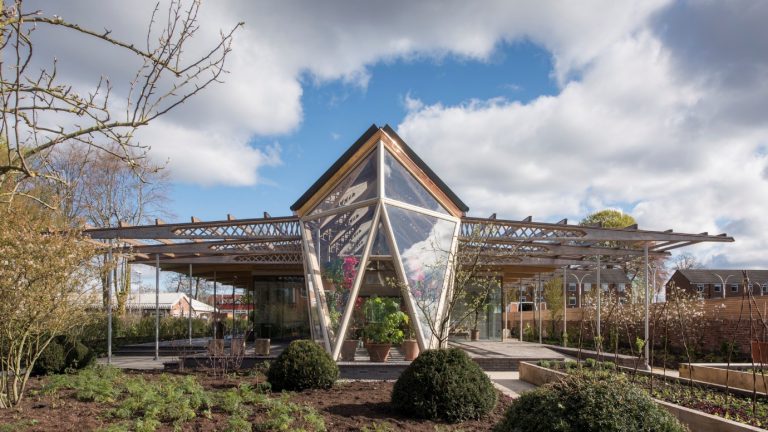
Foster + Partners are the latest architectural firm to take on a Maggie’s Centres project, with their new Manchester build opening its doors in 2016. At its heart is a timber-lattice structure, complemented by an angular greenhouse and a flourishing flower garden, which offers a peaceful sanctuary for cancer patients. The centre has been designed to feature as much natural light as possible, with windows running along each side and triangular skylights dotted throughout its mezzanine rooms.
The Life House
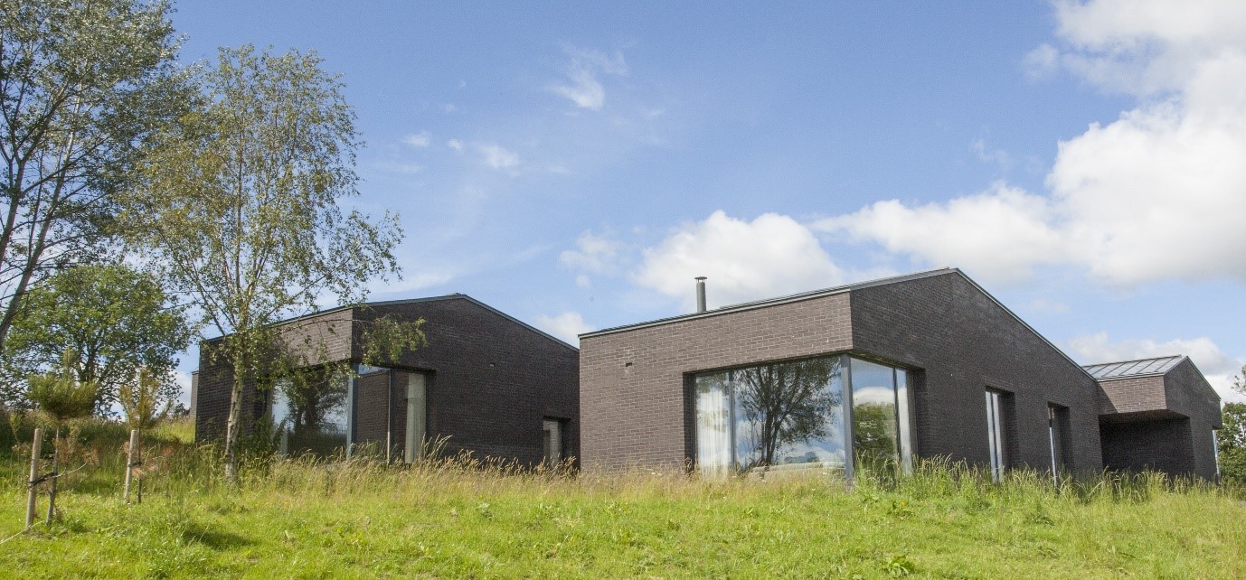
Living Architecture’s most recent build can be found in the deepest depths of the Welsh countryside. Designed by John Pawson to inspire connoisseurs of contemporary architecture, the holiday home focuses on a minimalistic style. White brick walls, pale timber beams, white-oiled Douglas fir ceilings and a wall of windows fill the interior. Meanwhile, the exterior has been created using Danish black brick to mirror the dark trees that surround the property.
Mason & Company craft beer house
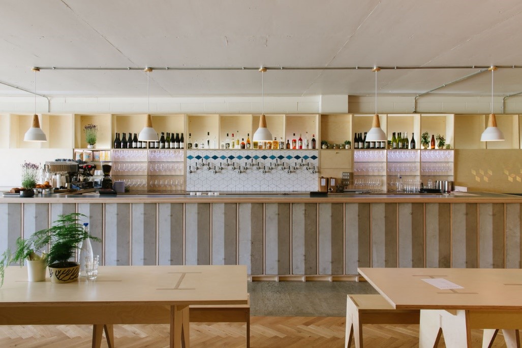
Timber was the material of choice for this project by Fleet Architects. The craft beer house was created using slatted timber screens and wooden parquet flooring to transform a once concrete shell into a cool new East London hotspot. It’s part of a larger ongoing project to redevelop the International Broadcast Centre from London’s 2012 Olympic Games. As the building’s exterior is made purely from concrete, the interior adds a contrasting element and warm tone to the space.
One noticeable takeaway from this year’s best buildings is the use of clever historical preservation. Whether a building screams heritage or has been designed to feature subtle vintage touches, this method can help to combine the key elements to good building design: sustainability, positive impact, clever budgeting, added value and longevity. But will this trend continue into the new year? Only time will tell.


