In the realm of urban planning and design, creating safe public spaces helps to foster vibrant and inclusive communities. While various factors contribute to the safety of these spaces, one aspect that can be overlooked is familiarity. In the Marshalls Safer Spaces survey, many people said that familiarity makes a difference to their overall feeling of security when interacting with a space, with one person commenting “ I feel most vulnerable in unfamiliar places, I don’t know where to run to if I need to get away.”
In this article we’ll explore the importance of familiarity in designing and building safer public spaces. Familiarity is one of the design pillars featured in the Creating Safer Spaces whitepaper, available to download now for free.
Design considerations for bringing more familiarity into public spaces
Public spaces that are welcoming, intuitive, and reflective of the local community's identity foster a stronger sense of ownership, encouraging people to use and care for these spaces. In the pursuit of safer and more inclusive communities, embracing familiarity is an essential ingredient for success.
Feature repetition in landscape design
When people are surrounded by elements they recognise and understand, they feel more at ease; creating an environment that they can easily navigate and comprehend increases their sense of confidence and reduces anxiety.
Where feature repetition is successfully integrated into the urban realm, users no longer need to be concerned with what ‘lies around the corner’ as a certain level of comfortable predictability takes effect.
Two ways to introduce feature repetition to encourage a sense of familiarity in landscape design;
1. Visual cohesion
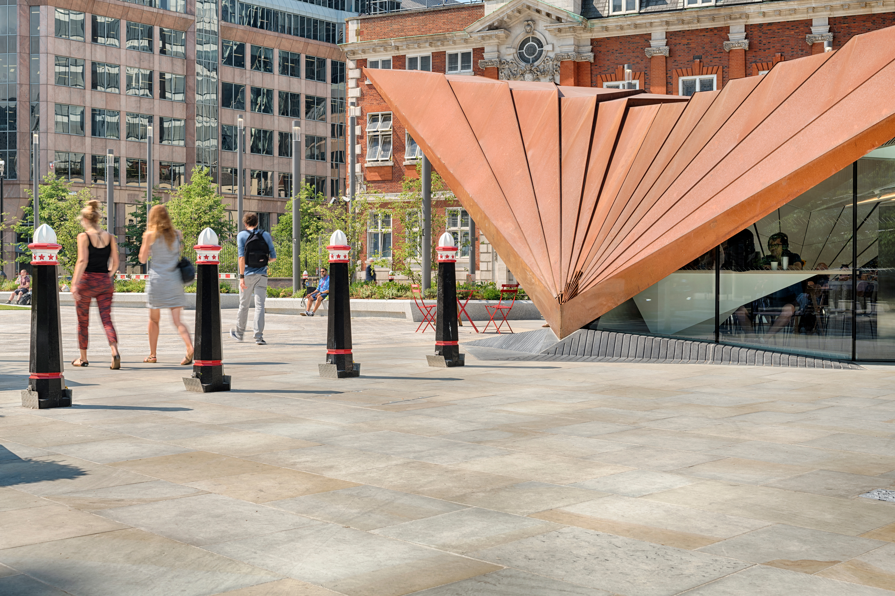
Scoutmoor is synonymous with the hard landscapes of the City of London
Repetition of design features, such as colours, materials, and patterns, creates visual cohesion within a landscape. By employing consistent design language, landscapes become more easily to navigate, reducing stress and promoting a sense of comfort. A great example of this is the use of Scoutmoor stone across the city of London. From the Southbank, to Aldgate Square, the consistent use of a small range of materials helps to create a subtle sense of place and identity as visitors move from one area to the next.
2.Enhancing wayfinding and orientation
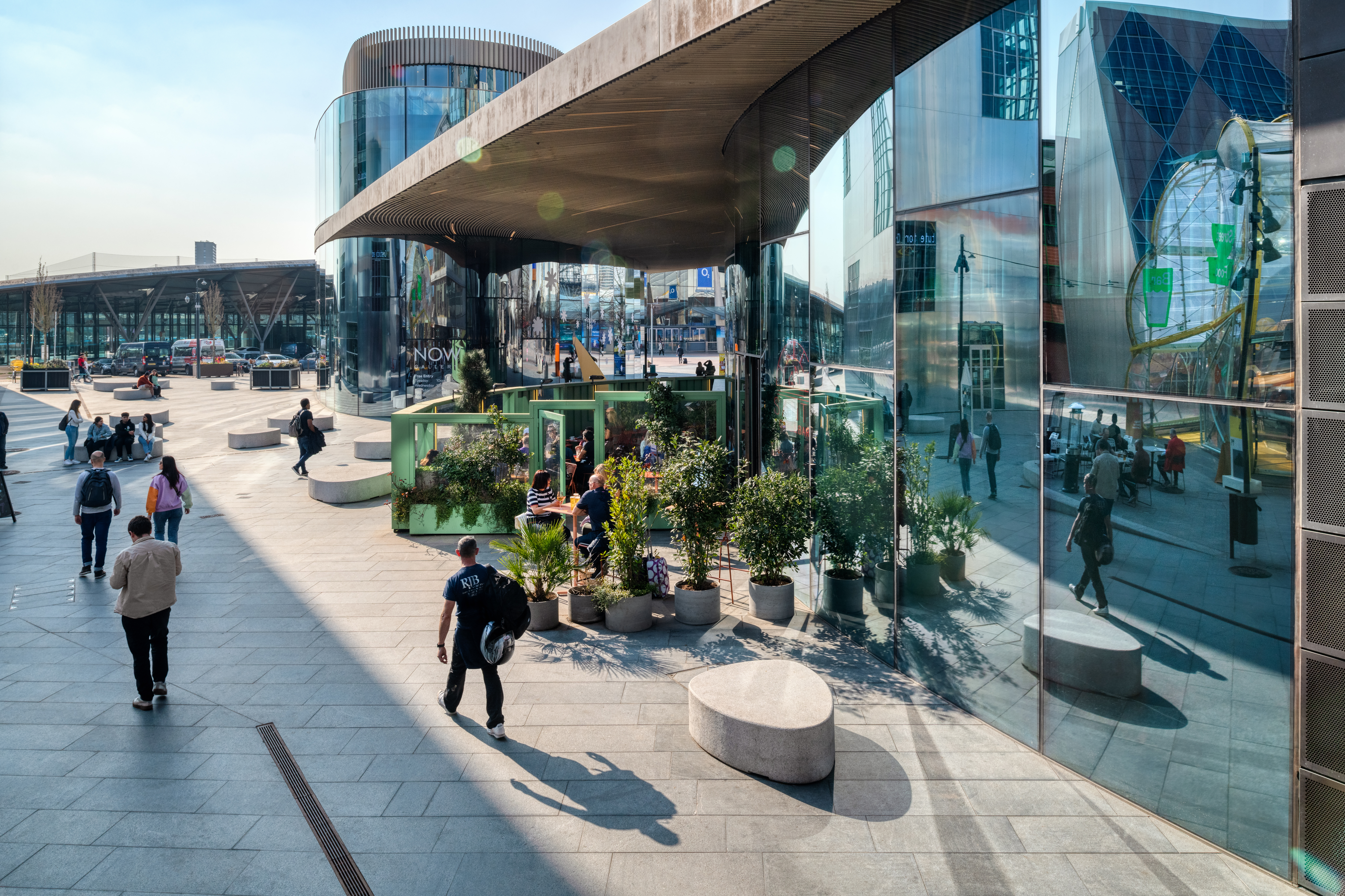
Irregular shaped seating across Greenwich Design District creates a sense of place as visitors move around
Consistent signage, lighting fixtures, or distinctive landmarks strategically placed throughout the landscape can serve as visual cues for navigation. When users encounter familiar elements repeatedly, they develop mental maps and easily recognise their surroundings. This familiarity fosters a sense of control and confidence, reducing the perception of being lost or disoriented and thereby increasing overall safety. Across Greenwich Design District, visitors will find irregular shaped granite seating across the entire development, making a larger area feel less daunting through the repeat of stand-out design items.
Using local characteristics in landscape design
Public spaces are at their best when they encourage social interaction and a sense of community. When people feel comfortable in their surroundings, they are more likely to engage with others, fostering a sense of belonging and unity. Design choices that reflect the local culture, incorporate elements that resonate with the community's identity, or celebrate local history can create a stronger emotional connection and encourage social cohesion.
Spaces tend to feel more familiar if they sit happily in the context of the local vernacular architecture. A site character assessment is a crucial part of the initial feasibility and often triggers ideas used within the design process, such as recollections of heritage, which increase pride and attachment to the space in question.
Two ways to introduce local characteristics to encourage a sense of familiarity in landscape design;
1. Incorporate natural elements
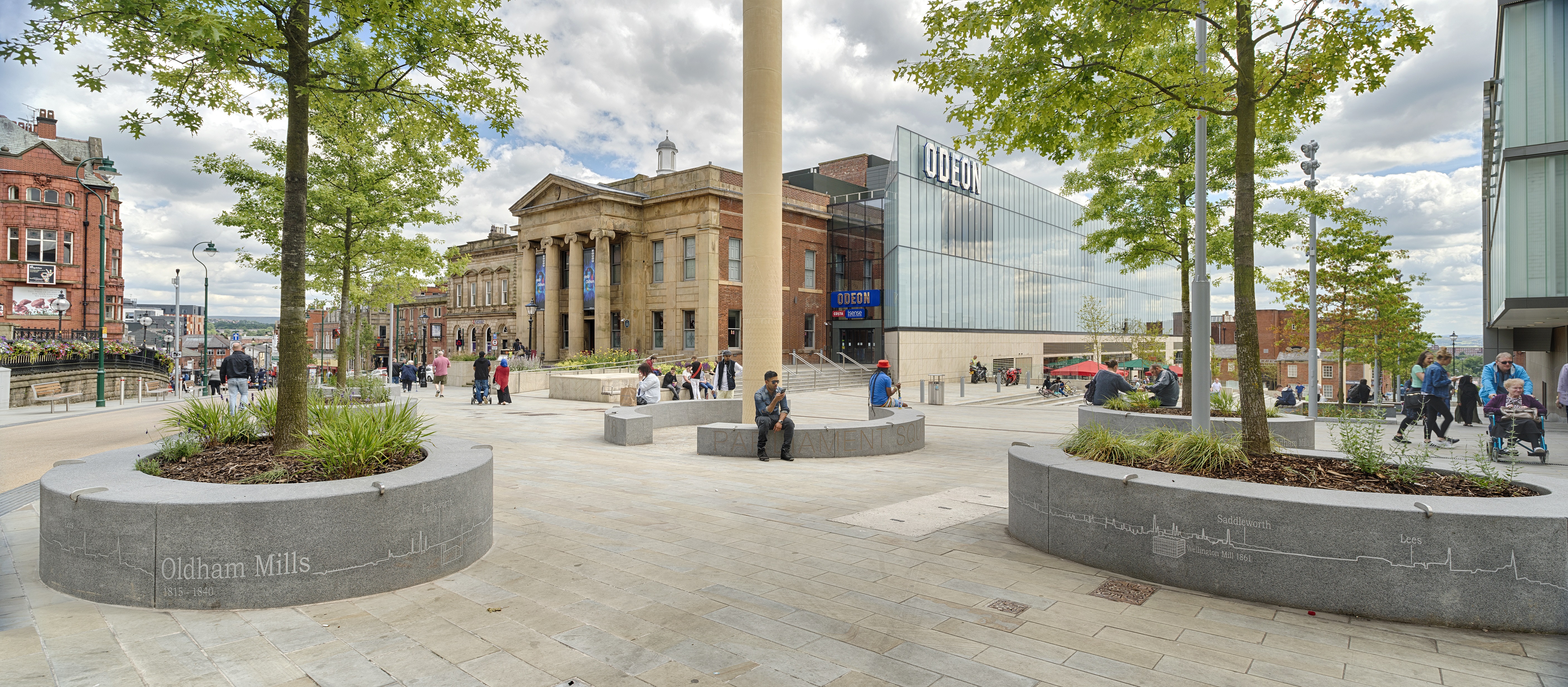
Scoutmoor stone was used in the regeneration of Oldham town centre, quarried less than 15 miles away
Landscape design can draw inspiration from the natural elements that define a local area, from the planting to use of specific colours and materials. In an area well-known for a particular building material, such as regional heritage stones, the frequent use of such material brings with it more of a connection to a place.
A good case study to highlight this is Oldham town centre, pictured above, the chosen paving was Scoutmoor, which was quarried less than fifteen miles away. Granite seating and planters were jet cut with details representing the textile trade in the local area to bring in more features that felt familiar and relevant to the local community.
2. Celebrate community and history 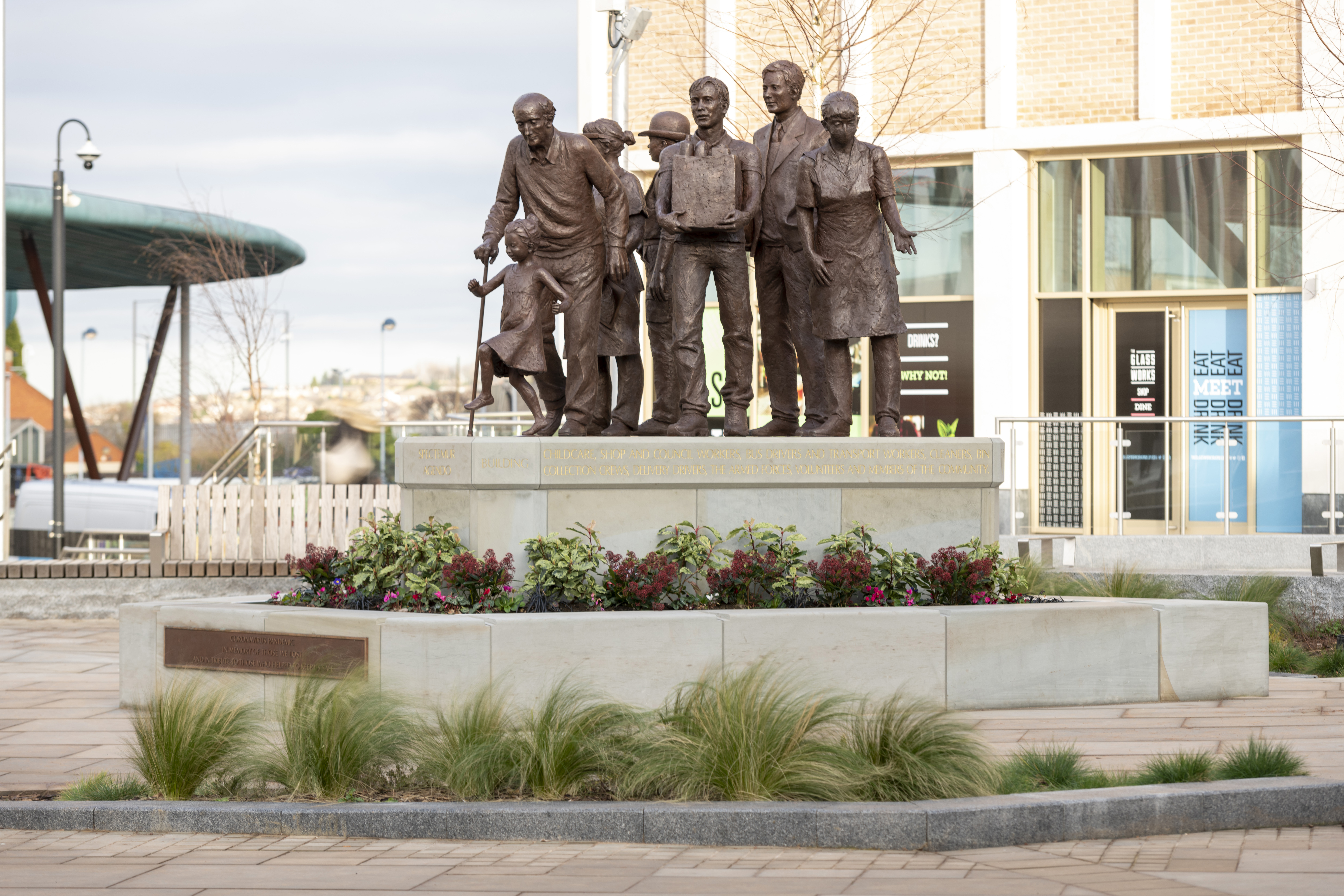
The Glass Works, Barnsley, featuring a sculpture to commemorate those who lost their lives during the pandemic
As with Oldham town centre, above, bringing in design elements that give a strong nod back to the local community or area’s history is an excellent way to create familiarity, enable a feeling of ownership, and improve feelings of safety. At The Glass Works in Barnsley, locally sourced stone was used to support a new bronze sculpture to commemorate those who lost their lives during the pandemic. And in Monument Street, London, granite seating was sandblasted then hand-painted with the words from the famous ‘London’s Burning’ rhyme, to commemorate the Great Fire of London, which began on the street.
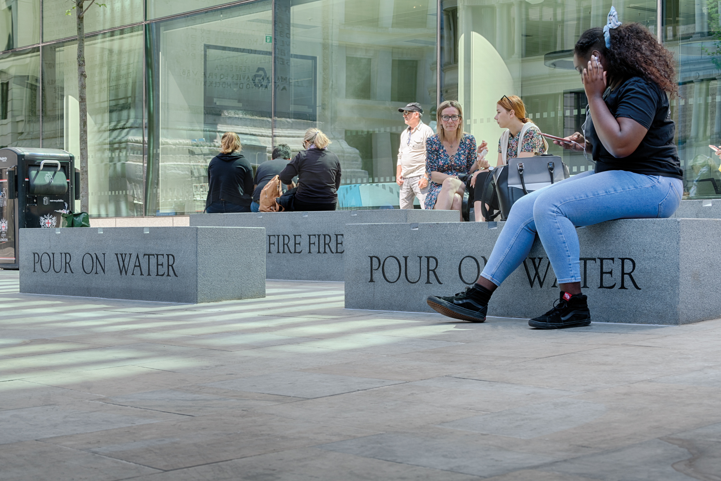
Incorporating the history of Monument Street into the landscape design
Landscape design has the power to not only reflect the existing community but also support their safety by creating inclusive and welcoming environments. In light of findings from the Safer Spaces survey, which revealed that gay men are twice as likely as heterosexual individuals to constantly consider their personal safety, it becomes even more important to design spaces that prioritise inclusivity and foster a sense of belonging. Taking the LGBTQ+ community as an example, landscape design can incorporate features such as rainbow-colored pathways and public art installations that highlight symbols and history. These visual representations of inclusivity and acceptance go beyond the celebration of Pride alone, ensuring a sense of belonging throughout the year. By integrating these design elements, landscape designers communicate a clear message of support for the LGBTQ+ community and create an environment that promotes safety, respect, and understanding.
In summary, when designing and building safer public spaces, familiarity emerges as a critical factor. By incorporating familiar design elements, we enhance perceived safety, promote social interaction, support wayfinding and accessibility, strengthen surveillance, and contribute to overall mental well-being.
FURTHER LEARNING ABOUT CREATING SAFER SPACES AND EYES ON THE STREET
As well as the whitepaper, you can now book our Creating Safer Spaces CPD, allowing you to use the insight and pillars for future space design. The session lasts an hour and can be delivered online or in person.


